 |
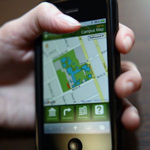
| You'll be able to call up the map on your iPhone. (Bruce Bottomley Photo) |
Students rushing from class to class. Faculty heading to their next lecture. Staff finding a space to meet. Visitors on campus looking for a public lecture.
H¬ĢĽ≠‚Äôs three campuses are full of people on the move. But with dozens of buildings sprawled across 32 hectares of land, finding where you‚Äôre headed can be challenging at the best of times. Thanks to the H¬ĢĽ≠ web project, though, it‚Äôs about to get a little easier.
As part of the redesign of the H¬ĢĽ≠ website (see: ‚ÄúWeb makeover reveal‚ÄĚ ), this week the university web team is launching the beta version of a digital, interactive campus map, one that takes the best features of several previous maps and adds new functionality.
‚ÄúOur existing campus maps have either been flat PDFs‚ÄĒwhich aren‚Äôt really web-friendly‚ÄĒor they‚Äôve been developed by a particular unit, for a particular objective, with the resources they could manage,‚ÄĚ says Graham MacDougall, associate director of the web team and project manager for the new map. ‚ÄúWe wanted to create an overall map for campus that provided the best experience to our users.‚ÄĚ
The web project provided the opportunity to gather data and expertise from different corners of the university‚ÄĒincluding Information Technology Services, GIS Centre, Communications and Marketing and Facilities Management‚ÄĒinto a single map, one built on the adaptable Google platform.¬†Expanded to include lots of Dal-specific applications, the¬†resulting product will be familiar to anyone who‚Äôs used Google Maps before.
 |
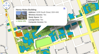
| Not sure where you're going? You can now consult the new campus map. |
For example, while the main Google Maps site does include Dal buildings, they’re more detailed and accurate on the university map. More importantly, clicking on or searching for a particular building pulls up a listing with its main functions and services. Even more valuable is the ability to quickly identify and locate amenities on campus like parking, bike racks, wireless and computer access and student study space. The map even includes transit data from Metro Transit.
‚ÄúYou can look at each bus stop on or near campus and see all the upcoming buses for the next three hours,‚ÄĚ says Jon Hartling, lead developer on the project.
The web team considers the map a work in progress; what‚Äôs launching this week is merely a starting point. For example, while the map is going live with a feature-limited browser-based version for iPhone/iPad/iPod Touch and Android phones, the web team hopes to make it fully functional for a variety of mobile devices. They‚Äôre also planning to make the map‚Äôs search tool more robust and working to integrate it with the main H¬ĢĽ≠ search feature. The map will include a feedback tool for users to submit their own ideas for further refinements.
‚ÄúOur guiding focus going forward is function first,‚ÄĚ adds Mr. MacDougall. ‚ÄúIt‚Äôs about helping people find what they need to live, work and study at Dal.‚ÄĚ
